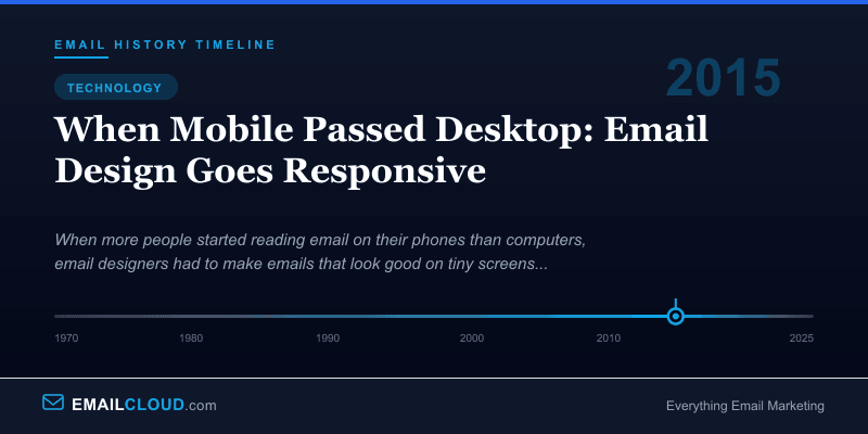
2015: When Mobile Passed Desktop: Email Design Goes Responsive
By 2015, the data was inescapable. Litmus, the email analytics platform that tracked opens across billions of messages, reported that mobile email opens had crossed 55% and were climbing. For the first time in email’s history, more people were reading email on a phone than on a computer.
This wasn’t a surprise to anyone who’d been paying attention. Smartphone adoption had been climbing steadily since the iPhone launched in 2007, and mobile email usage had been rising for years. But crossing the 50% threshold forced a reckoning. Email designers could no longer treat mobile as a secondary consideration — it was the primary viewing environment.
The 600-Pixel Problem
For the first 15 years of HTML email, designers worked within a comfortable constraint: a 600-pixel-wide layout. This width fit nicely in desktop email clients, left room for the application chrome (toolbars, sidebars, folder lists), and had become an industry standard. Templates, tools, and best practices all assumed 600 pixels.
A smartphone screen in portrait mode is approximately 320-375 pixels wide. A 600-pixel email rendered on a 375-pixel screen either scaled down (making text and buttons tiny and unreadable) or required horizontal scrolling (which people tolerate about as well as they tolerate dentist visits). Neither option was acceptable when a majority of your audience was viewing on mobile.
The solution was responsive design — a concept borrowed from web development where Ethan Marcotte had coined the term in a landmark 2010 article for A List Apart. Responsive design uses CSS media queries to detect the screen size and apply different styles accordingly. On a desktop, the email might display in two columns with large images. On a phone, the same email would reflow to a single column with larger touch-friendly buttons.
The Email Client Problem
If responsive email design were as straightforward as responsive web design, this story would be one paragraph long. It was not.
Web browsers implement CSS standards with reasonable consistency. Modern Chrome, Firefox, Safari, and Edge all render the same CSS very similarly. Email clients do not. Each one is its own unique rendering nightmare:
Outlook 2007 and later (on Windows) uses Microsoft Word’s rendering engine for HTML. Yes, a word processor. This means Outlook ignores many CSS properties, doesn’t support background images properly, has its own opinions about padding and spacing, and treats floats and flexbox as exotic fantasies. Outlook’s market share in corporate environments made it impossible to ignore.
Gmail stripped <style> tags from HTML emails until 2016, meaning CSS had to be inlined — every style attribute manually applied to every HTML element. When Gmail finally added <style> support in September 2016, email designers celebrated like it was the moon landing.
Apple Mail on iOS was, ironically, the best email client for responsive design. It fully supported media queries, modern CSS, and rendered HTML email much like a web browser. This was the good news. The bad news was that the email that looked perfect in Apple Mail might look broken in every other client.
Yahoo Mail and Outlook.com had their own quirks, stripping some CSS properties, adding their own styles, and occasionally rewriting HTML in creative ways.
The result was that responsive email design required writing code that worked across all these environments — or at least degraded gracefully in the ones that couldn’t handle it.
The Technical Solutions
Email developers (a community with the patience of saints and the debugging skills of forensic investigators) developed several approaches:
Fluid design used percentage-based widths instead of fixed pixel widths. A table set to 100% width naturally fills whatever container it’s in, whether that’s a 600-pixel desktop client or a 375-pixel mobile screen. This was the simplest approach and worked in virtually every client, but it limited layout options.
Responsive design with media queries used @media CSS rules to apply different styles at different screen sizes. This was the gold standard — it allowed complex desktop layouts that gracefully simplified for mobile — but it only worked in clients that supported media queries (Apple Mail, iOS, some Android clients) and was ignored by Gmail and Outlook.
Hybrid/spongy design, pioneered by email developer Nicole Merlin and popularized by Remi Parmentier, combined fluid tables with max-width constraints to create emails that adapted to screen size without relying on media queries. This approach worked in Gmail, Outlook, and Apple Mail simultaneously — a remarkable achievement given their differences.
Mobile-first design flipped the traditional approach, designing for the smallest screen first and adding complexity for larger screens. Since most opens were on mobile, this ensured the mobile experience was always the best version.
The Impact on Email Marketing
The mobile transition changed more than just layout. It affected every aspect of email marketing:
Subject lines got shorter. Mobile screens display approximately 30-40 characters of a subject line, compared to 60-70 on desktop. Marketers learned to front-load the most important words and keep subject lines concise. Preheader text (the preview text shown after the subject line) became a crucial secondary hook.
Buttons got bigger. Apple’s Human Interface Guidelines recommend touch targets of at least 44x44 pixels. Tiny text links that worked fine with a mouse cursor were impossible to tap accurately with a thumb. CTA buttons grew in size and prominence, with generous padding to prevent mis-taps.
Content got shorter. People reading email while waiting for coffee or riding the subway have less patience for long-form content. Emails became more scannable — shorter paragraphs, clear headings, bullet points, and a single focused call to action.
Testing got more complex. Designers now needed to verify rendering not just across email clients, but across screen sizes within each client. An email that looked right in Gmail on a desktop might not look right in Gmail on a Pixel phone, which might not look right in Gmail on an iPhone.
Where Things Stand
By the mid-2020s, mobile-first email design is standard practice. Most email marketing platforms offer responsive templates by default. Tools like Litmus and Email on Acid provide preview testing across dozens of client-device combinations. The technical challenges haven’t disappeared — Outlook still uses Word’s rendering engine, and new variables like dark mode have added complexity — but the industry has developed mature solutions for most scenarios.
The mobile transition was, in retrospect, one of the most significant shifts in email marketing history. It forced the industry to prioritize the reader’s experience over the designer’s preferences, to simplify rather than elaborate, and to respect the physical constraints of the devices people actually use. Those lessons extend well beyond email design — they’re principles for effective communication in a mobile-first world.
Infographic
Share this visual summary. Right-click to save.
Related Events
Frequently Asked Questions
When did mobile email opens surpass desktop?
Mobile email opens consistently exceeded desktop opens starting around 2015. Litmus data showed that by mid-2015, approximately 55% of emails were opened on mobile devices, with the share continuing to grow in subsequent years.
What is responsive email design?
Responsive email design uses CSS media queries and fluid layouts to automatically adjust an email's layout, font sizes, images, and button sizes based on the recipient's screen size. Content reflows from multi-column on desktop to single-column on mobile.
Why is responsive email design difficult?
Unlike web browsers, email clients have inconsistent CSS support. Outlook uses Microsoft Word's rendering engine, Gmail strips certain styles, and each client handles media queries differently. Designers must use fallback techniques and extensive testing.