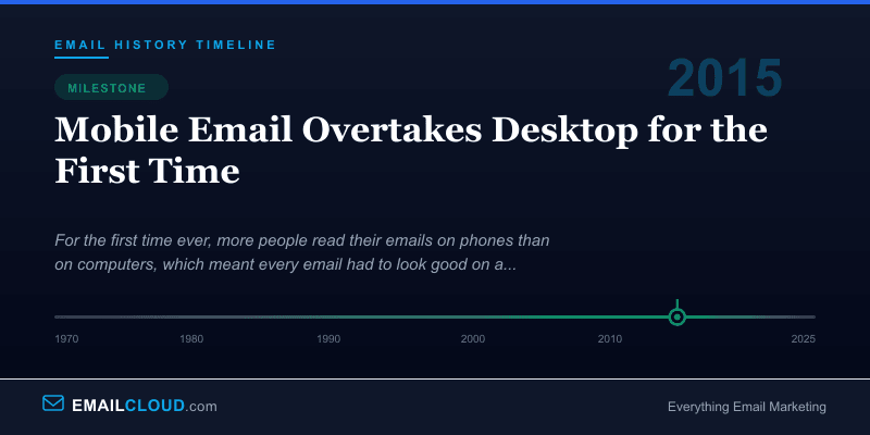
2015: Mobile Email Overtakes Desktop for the First Time
Sometime during 2015 — the exact date is impossible to pin down because the shift was gradual and measured differently by different firms — a threshold was crossed that the email industry had been anticipating for years. For the first time, more than half of all emails worldwide were opened on mobile devices. The desktop inbox, which had dominated email interaction for four decades, was no longer the primary way humans engaged with email.
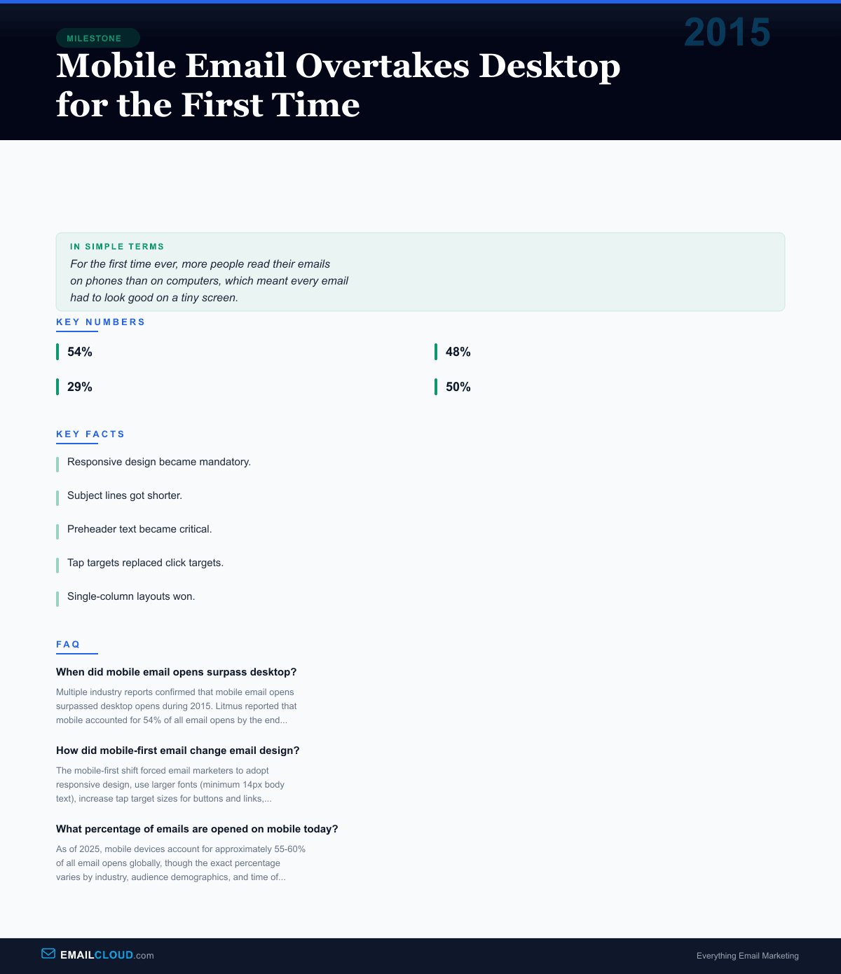
Litmus, the email testing platform that tracked billions of email opens across its customer base, reported that mobile had reached 54% of all opens by the end of 2015, up from around 48% at the start of the year and just 29% three years earlier. The email analytics company Movable Ink reported similar numbers. Return Path’s data corroborated the trend.
The smartphone had not just changed where people read email. It had changed what email needed to be.
The Long Build-Up
The mobile email revolution didn’t happen overnight. It was a slow tide driven by smartphone adoption curves that were steeper than almost anyone predicted.
When Apple launched the iPhone in 2007, the device’s email client was a revelation — a full HTML rendering engine in your pocket, capable of displaying rich emails the way they were meant to be seen. But in 2007, smartphones were still expensive luxury items. By 2010, when Android devices began flooding the market at lower price points, the mobile email audience started growing in earnest.
The BlackBerry craze had proven that people wanted mobile email, but BlackBerry’s tiny screens and limited rendering capabilities meant that mobile email was largely a text-only experience. The iPhone and Android changed the equation entirely. Now people expected the same rich HTML emails on their phones that they saw on their desktops — and they expected them to look good.
The Design Revolution
The crossing of the 50% threshold in 2015 was less a moment of surprise than a confirmation of what forward-thinking email marketers had been adapting to for years. But it was the data point that ended the debate. You could no longer treat mobile as a secondary consideration in email design. Mobile was the primary screen, and desktop was the fallback.
This reality demanded fundamental changes in how emails were built.
Responsive design became mandatory. Before 2015, many email marketers used fixed-width layouts optimized for desktop — typically 600 pixels wide. These emails required pinching and zooming on mobile screens. Responsive design, using CSS media queries to adapt layout to screen size, went from nice-to-have to non-negotiable.
Subject lines got shorter. Desktop email clients typically display 60-70 characters of a subject line. Mobile clients display 30-40, depending on the device. This forced marketers to front-load the most important words and think of subject lines as headlines, not sentences.
Preheader text became critical. Mobile email clients prominently display the first line of text (or hidden preheader text) alongside the subject line. This secondary line of text, largely invisible on desktop, became prime real estate on mobile — essentially doubling the space available to convince someone to open.
Tap targets replaced click targets. A mouse pointer is precise. A finger on a touchscreen is not. Links and buttons needed to be at least 44x44 pixels (Apple’s recommended minimum tap target) with adequate spacing to prevent accidental taps. The era of tiny text links in emails was over.
Single-column layouts won. Multi-column email designs that looked elegant on wide desktop screens became unreadable messes on 320-pixel-wide phone screens. The industry converged on single-column layouts that stacked content vertically, making emails scroll-friendly on mobile.
The Business Impact
The mobile email shift didn’t just change design — it changed strategy. The data revealed that mobile email users behaved differently from desktop users in ways that mattered for revenue.
Mobile email opens peaked during commuting hours (7-9 AM, 5-7 PM) and late evening (9-11 PM), while desktop opens dominated during traditional work hours (9 AM - 5 PM). This meant that the same email sent at the same time could reach two fundamentally different audiences depending on the device.
Mobile email sessions were shorter. Users spent an average of 11 seconds reading an email on mobile versus 20 seconds on desktop, according to Litmus research. This compressed the window marketers had to communicate their message and drive action.
But mobile also created opportunities. Location-aware email campaigns — sending offers when a subscriber was near a physical store — became possible for the first time. The immediacy of mobile meant that time-sensitive promotions (flash sales, limited offers) could reach customers who were already out in the world, ready to act.
The Infrastructure Response
Email service providers invested heavily in mobile-optimized template builders and preview tools. Mailchimp, Campaign Monitor, and others rebuilt their template editors with mobile-first design principles. Litmus and Email on Acid expanded their preview capabilities to show emails across dozens of mobile devices and email clients.
The coding standards for email HTML also evolved. Frameworks like MJML and Foundation for Emails emerged to simplify the creation of responsive email templates, abstracting away the complex table-based layouts and conditional CSS that responsive email required.
The Lasting Change
The 2015 mobile crossover was not a temporary fluctuation. Mobile’s share of email opens has remained above 50% every year since, hovering in the 55-60% range through the mid-2020s. Some industries — particularly retail, hospitality, and entertainment — see mobile open rates above 70%.
The shift rewired the email industry’s priorities. Speed, simplicity, and scannability replaced density and detail. The most effective emails became those that communicated a single clear message with a single clear call to action — because that’s what works on a 6-inch screen during a 30-second subway commute.
Every email you send today is most likely to be read on a phone screen first. Make sure those first few words count — test with our Subject Line Grader to optimize for mobile-length display.
Infographic
Share this visual summary. Right-click to save.
Related Events
Frequently Asked Questions
When did mobile email opens surpass desktop?
Multiple industry reports confirmed that mobile email opens surpassed desktop opens during 2015. Litmus reported that mobile accounted for 54% of all email opens by the end of 2015, up from roughly 29% in 2012. The shift had been building for years, driven by smartphone adoption and improved mobile email apps.
How did mobile-first email change email design?
The mobile-first shift forced email marketers to adopt responsive design, use larger fonts (minimum 14px body text), increase tap target sizes for buttons and links, use single-column layouts, and dramatically shorten subject lines. Preheader text became critical since mobile clients display it prominently alongside the subject line.
What percentage of emails are opened on mobile today?
As of 2025, mobile devices account for approximately 55-60% of all email opens globally, though the exact percentage varies by industry, audience demographics, and time of day. B2B emails tend to have higher desktop open rates during business hours, while B2C emails skew heavily mobile.